
The MNU Brand
MNU’s brand strategy is heavily reliant on bold use of colour, strong typography, and graphic elements to help tell our story.
As a labour organization, advocating for nurses, patients and healthcare province-wide, we regularly touch on heavy topics, but we try to approach the challenges with impactful, memorable communication.
What can we say? We’re a bit sassy as we continue to fight the good fight.
Our brand personality is important to us. We want our messaging to resonate—not only with our nurses, but with the public and various healthcare stakeholders.
Because this fight is for ALL of us.
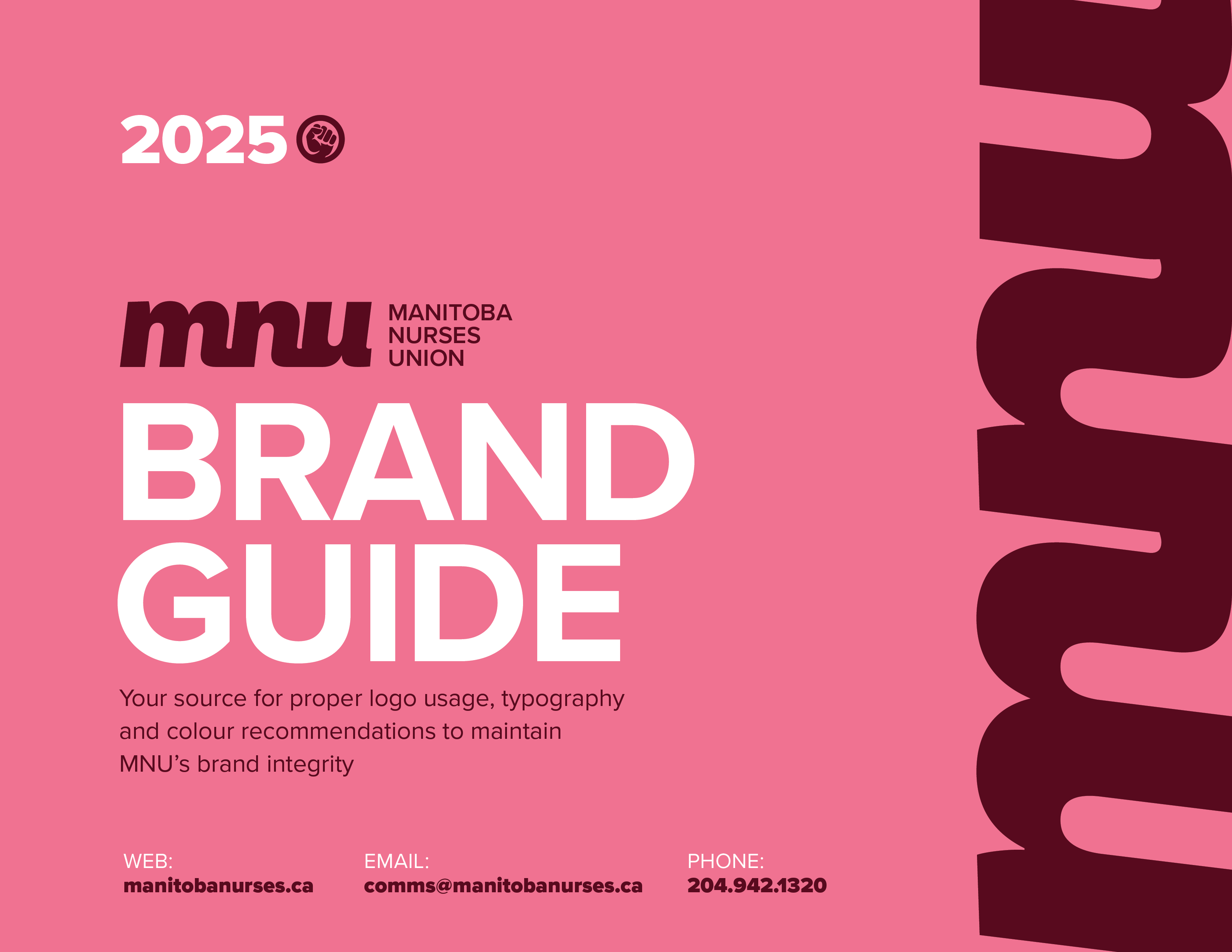
Click the image to download the MNU Brand Guide.
![]()
Our Logo
This year we launched our new logo. While celebrating our 50th anniversary, we were inspired by the 70s, when it all started...
Like they say: everything old is new again, and that certainly rings true. We’re bringing a ‘retro vibe’ into a modern brand aesthetic, and that complementary combination enhances our current MNU brand identity, while giving a subtle nod to the past. Furthermore, the curvature and connected letters of the logo reflect unity and solidarity, and symbolize the comfort and care nurses provide.
A soft, friendly logo and colour palette—in juxtaposition with a sassy, bold brand personality aims to represent the ability for both things to be true about nurses: They are nurturers with big hearts, big compassion and big love for patients, but they are also highly-skilled, tough as nails, badass professionals.
Full Colour
This is the standard MNU logo and should be your go-to version whenever possible. For colour projects, use the EPS file for print (CMYK) and the PNG file for digital (RGB). Always place it on a white or very light background to maintain contrast and legibility.
White Reverse
Use the white MNU logo on darker solid colours, textures, or photos to maintain contrast and legibility. For colour projects, use the EPS file for print (CMYK) and the PNG file for digital (RGB).
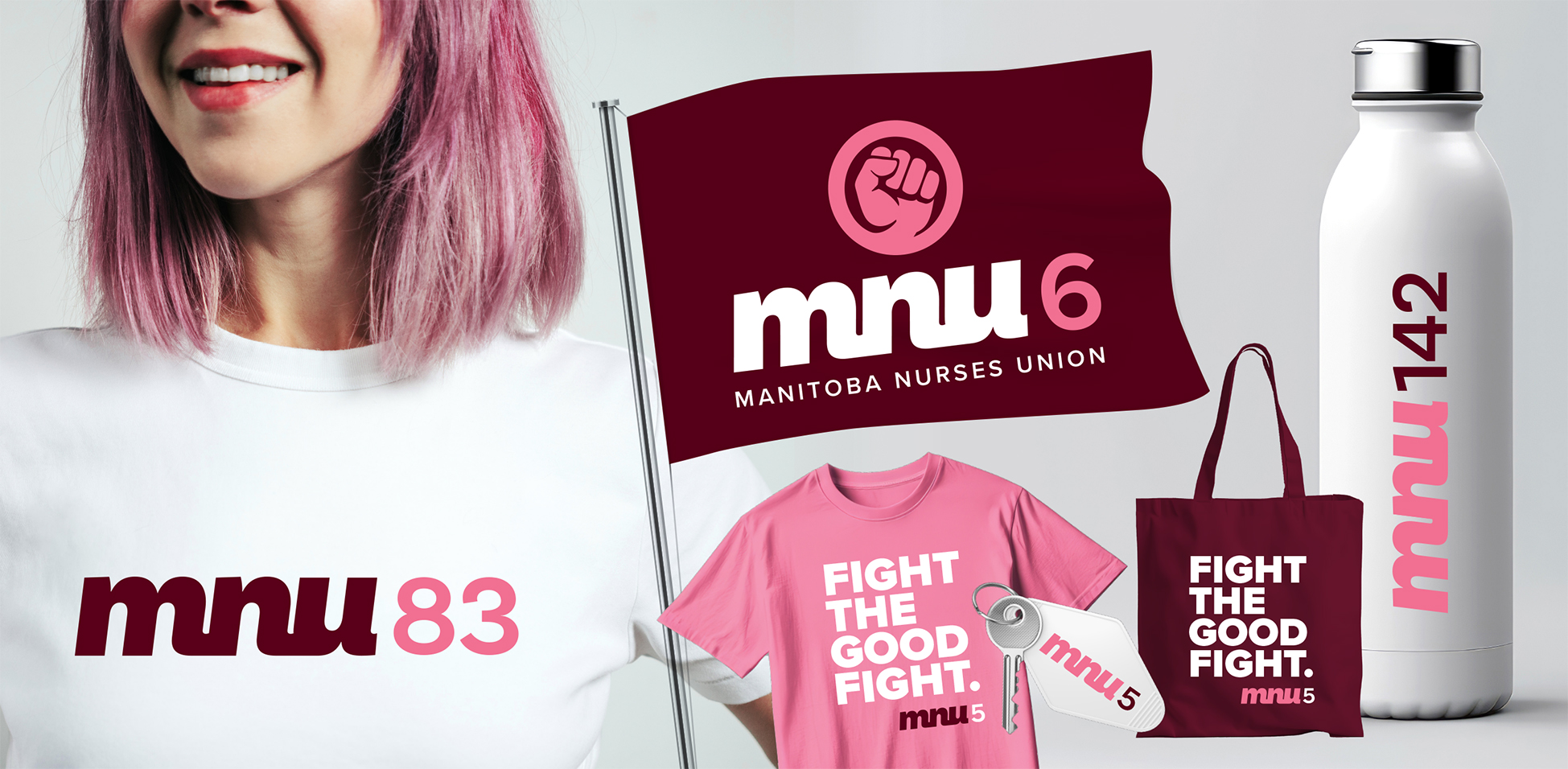
Local/Worksite Logos
With a rebrand, we wanted to provide custom logos to our vast group of Local/Worksites. We know our members love the communities they provide care for, so we’ve created unique logos for each one. They still fall under the MNU umbrella, but give Local/Worksites the opportunity to represent themselves with pride.
To access and download your Local/Worksite logo:
- Click the link below to open Dropbox.
- Select the folder of your Local/Worksite by clicking on the checkbox to the left of the folder.
- Once your folder is checked, click "download."
Download Your Local/Worksite Logo
To make sure you’re using your Local/Worksite logo correctly and staying true to MNU’s brand, check out the MNU Brand Guide at the top of this page. Need a hand or have questions? Reach out to MNU Communications at comms@manitobanurses.ca.
Note: EPS files are professional print files and can’t be opened on most devices. They’re meant for use by print shops, graphic designers, or merchandise vendors only.